Brand creation, product design
Between 2019 and 2021, I was head of brand and experience design for IBM Watson Health. IBM built Watson Health in 2016 through a series of acquisitions. The business would use technologies from core Watson, IBM’s AI, and apply them across a range of health sectors—life sciences, imaging, government health and human services, payer and provider.
But where core Watson excelled in communicating the benefits of machine learning to a scientific audience, Watson Health had to be more human. It aimed to build trust, build bonds, and add humanity to technology that was not widely understood.
The Watson Health brand carves out a distinct space, both part of yet separate from core Watson.
Dot language
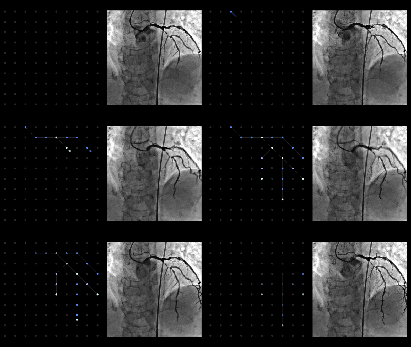
Since AI is purely intangible, we rely on a robust library of dot graphics and iconography to express capabilities, solutions, and concepts to which Watson is applied.
The dot is IBM’s metaphor for data. As Watson is primarily a data tool, the dot is used extensively in Watson communications. As we sort, structure, and retrieve insights from data sets, the dot expresses these in animation, graphic representation and dimensional narratives.
Interoperability
Augmentation
Pictograms
Pictograms are a useful tool in communicating more concrete subjects or concepts. IBM Design Language (IDL) provides a framework for the use and creation of pictograms is both expressive (shaded line) and productive (simple line) formats. We expanded the IDL set to include a host of health-specific pictograms which apply to Watson Health solutions and industries.
Productive pictograms
Expressive pictograms
In addition, IDL provides a set of guidelines for the creation of application icons. Where the core IBM application icons resemble expressive pictograms, the Watson Health application icon style is simple, filled geometry. It adds a less technical, more approachable interaction moment for users, in keeping with the brand traits.
Illustration
The Watson Health illustration style borrows from, and has helped define, core IBM Design Language guidance. Our illustrations are composed of three primary styles; line, flat, and isometric. Line style and flat style illustrations are drawn on the same pixel grid as our pictograms and application icons. Isometric illustrations are drawn on a similar grid in the isometric space. The result is a harmonious design system regardless of the style, and distinctly IBM.
Infographics & data visualization
Watson is, first and foremost, a data tool. As such, in all our communications, the quantitative display of data must be clear and meaningful. The Watson Health data visualization library has helped define the data display standards across core Watson communications. Subtle animation helps make data digestible and delightful, while the overall color system is true to the brand identity while being highly accessible.
Product
Region
Global
Agency partners
AKQA, GPJ, Centerline, Myriad Media
Disciplines
Brand design, interaction design, event and environmental design, product design, content creation, advertising campaign creation
Performance metrics
Watson Health brand value in 2018 - $240M
Watson Health brand value in 2022 - $1B
Brand familiarity:
2018 – 75%
2023 – 91%
Brand confidence:
2018 – 45%
2023 – 63%


